MetaLearner Internship Handoff
Product redesign, data visualisation, onboarding, and real-time systems research presented as evidence of how I think, execute, and hand work over.
What I want people to remember from this presentation
Cross-functional execution
I contributed across product design, frontend implementation, onboarding content, and technical research.
Strong product thinking
I identified higher-leverage UX and design-system problems instead of only solving the first visible task.
Visible shipping velocity
I produced real graph pages, onboarding work, demos, screenshots, and handoff-ready artifacts.
Good collaborator under feedback
I adjusted direction quickly after reviews with engineering, design, and business stakeholders.
How the internship scope evolved
Phases
- Started with frontend onboarding and an initial chart task.
- Expanded into mobile redesign and design-system thinking.
- Shifted into desktop-first UX after stakeholder review.
- Landed in onboarding, user guides, and broader handoff material.
What this shows
The internship was not one fixed ticket. It was a sequence of connected workstreams shaped by product discovery, feedback, and execution.
Early delivery established trust quickly
First concrete contribution
- Implemented the initial bubble graph discussed during onboarding.
- Improved it with significance-level labels.
- Added categorical grouping on hover.
- Improved cursor tracking for better interaction quality.
Feedback from the team
These messages matter because they show the quality of the work was visible early, before the scope broadened into larger UX problems.
I moved from solving a task to diagnosing the deeper product problem
Problems I identified
- The existing mobile experience compressed and broke visually.
- There was no strong central design library guiding decisions.
- First-time users had weak product orientation.
- The UI did not always clearly surface product value.
What I did with that
- Reviewed the codebase and used ShadCN as a practical foundation.
- Started building a lightweight design direction instead of isolated screens.
- Treated onboarding and product education as part of the UX problem, not separate from it.
Design-system work and UX direction became a reusable product layer
What I explored
- ShadCN-based design kit for spacing, colours, typography, and component consistency.
- Mobile-first dashboard and graph views during the early redesign phase.
- Desktop-first redesign after alignment on real user behaviour.
- Chat as a core interaction surface rather than a side panel.
- KPI cards, alerts, overlays, filters, and chat states for clearer flows.
Why it mattered
This work created a more coherent direction for how MetaLearner should guide users, not only how it should look. It connected visual consistency to product clarity and adoption.
Stakeholder review changed the work in a good way
What changed after feedback
I shifted from mobile-first exploration to desktop-first clarity because desktop was the primary surface for actual users.
What became more central
Chat-led workflows, first-time-user clarity, product value communication, and KPI categorisation became more important than purely visual refreshes.
Business grounding
I used calls and in-person conversations to better understand how customers use the product and how the business wants it framed.
What this demonstrates
I can absorb feedback quickly and use it to improve direction rather than treating feedback as friction.
Graph work stayed a strong implementation thread throughout
What was implemented
- Bubble-graph interaction improvements.
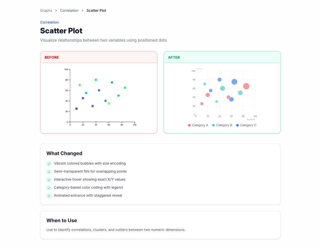
- Graph gallery implementation under the public /graphs/* routes.
- Before/after chart comparisons to show improvement quality.
- Guidance on when each chart type should be used.
- 9 chart demos, 6 categories, and 3 locales in the current repo.
Representative live capture
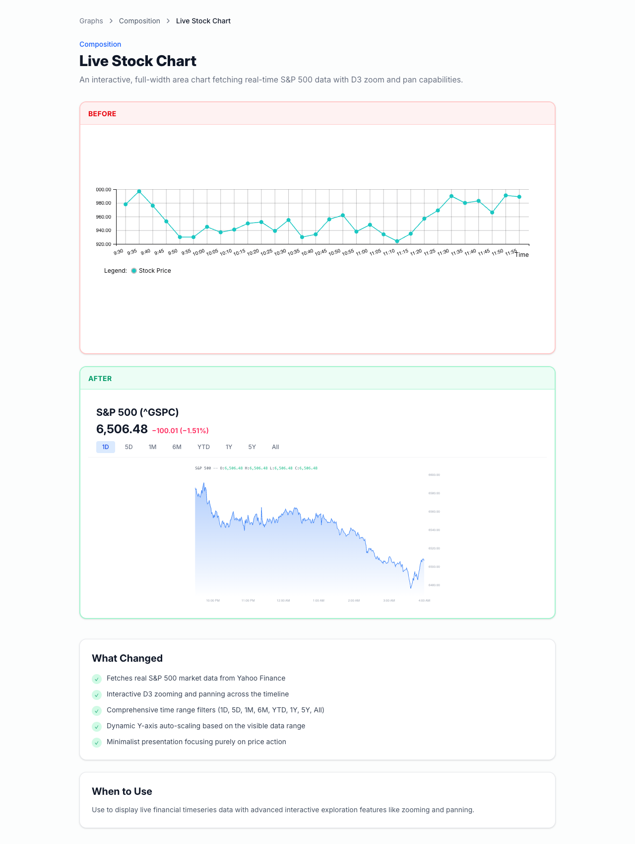
Captured from the current local app with Playwright. This is useful because it shows both the before/after pattern and the advanced chart direction.
The chart work also demonstrates engineering depth
Under the hood
- Config-driven chart definitions.
- Reusable routing structure under /graphs/ and /graphs/$chartSlug.
- D3.js rendering plus Framer Motion for interaction and polish.
- i18n-ready content model across en, es, and pt.
- Reusable legends, tooltips, palettes, and comparison patterns.
Standout example
- The stock chart fetches data through /api/yfinance.
- It supports hover inspection, zoom, pan, time-range filtering, and dynamic axis scaling.
- It shows that the work combined frontend architecture, interaction design, and visual polish.
Onboarding and the User Guide became a real implementation track
What was implemented
- Onboarding modal with swipe gestures and step navigation.
- "Find out more" links into a User Guide.
- User Guide hub page plus guide-detail pages.
- 4 guide categories: Dashboard Overview, Drill Down into the Details, Ask and Extract Your Data, and Settings.
- Prompt-writing guidance and suggested-question guidance for first-time users.
Proof from the internship build
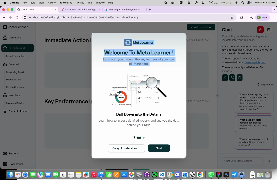
This frame was extracted from the WhatsApp demo video. Use it together with the user-guide screenshots from the internship chat thread for the strongest visual proof.
The onboarding work solved adoption, not just presentation
Better orientation
The guide pages kept the left sidebar visible so users stayed grounded in the product while learning it.
Lower interruption cost
"Find out more" links opened in a new tab so onboarding flow was not broken.
Better prompt quality
The guide content included prompt-writing help, suggested-question usage, and multi-turn conversation framing.
Validation
Lim’s feedback explicitly highlighted the value of the user guide as a way for users to access detailed instructions.
Real-time messaging research repo for future team use
What the repo includes
Separate reference artifact: Ducksss/socketio-chat
- FastAPI backend
- WebSocket-based messaging
- Redis pub/sub for cross-instance fan-out
- PostgreSQL persistence
- JWT auth and Docker Compose setup
- Architecture and sequence diagrams
Why it mattered
It gave the team a concrete reference architecture for future real-time collaboration or notification features without adding immediate production scope.
Links and artifacts people can check themselves
External links
- Figma redesign file
- Graph-gallery walkthrough video
- Real-time messaging research repo
- Lunr.js reference for the future-search discussion
Local artifact pack
- Artifact manifest with recommended visuals
- Live stock-chart capture
- Live scatter-plot capture
- Onboarding demo frame
Why this body of work makes me strong
I find leverage
I moved from an initial task into broader product, onboarding, and design-system opportunities when I saw the underlying problem.
I work across layers
I can contribute across UI direction, frontend implementation, content strategy, and technical research.
I improve under feedback
I used stakeholder reviews to sharpen the work instead of treating changing direction as a setback.
I leave things reusable
I did not just build screens. I left behind routes, assets, guides, demos, and reference material other people can continue from.
Thank you
I am happy to walk through the chart work, UX direction, onboarding flow, or any of the linked artifacts in more detail.
Design direction
Responsive exploration, ShadCN-based system thinking, and product-guided UX iteration.
Implemented work
Graph-gallery routes, onboarding flow, guide content, and supporting frontend assets.
Reference material
Research repo, walkthrough video, Figma explorations, and the artifact pack for review.